
What You'll Learn in 30 Seconds
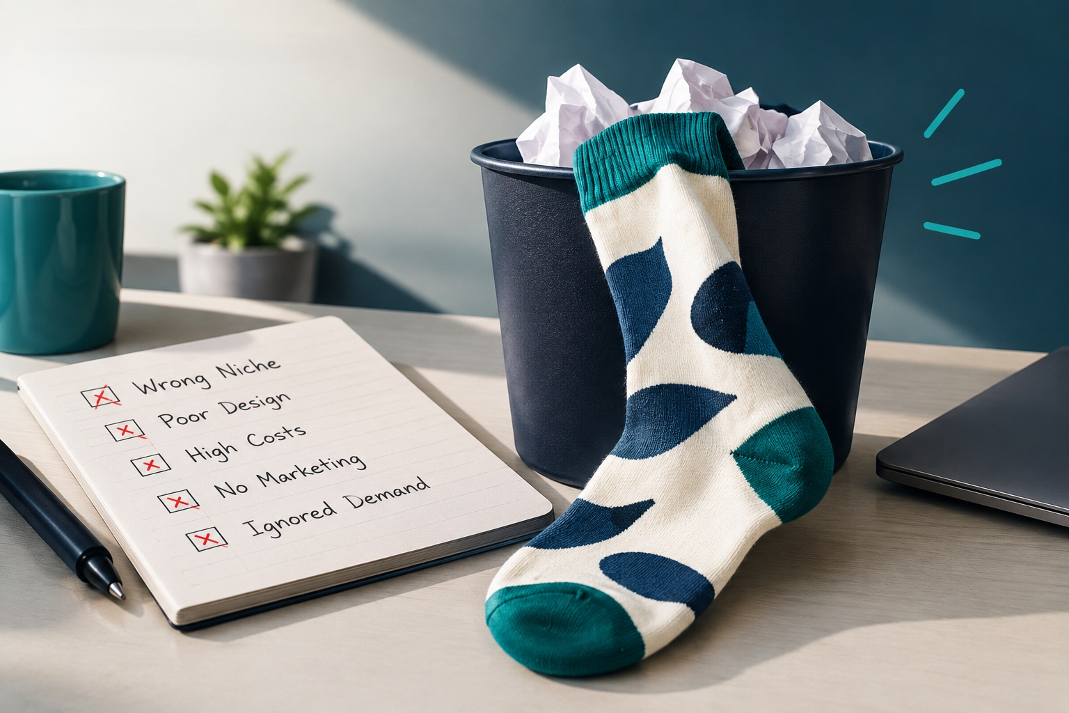
There is a drawer in every house where branded socks go to die. Next to it, in the same drawer, sits one pair that gets worn constantly. Nobody planned that split, but it was decided long before the socks shipped. This article is all about ending up in the second pile.
Design is not the decorative part of this decision. It is the part that decides whether the socks get worn. In PPAI's 2025 consumer study, nearly 90% of people said design affects whether they keep a branded product at all.
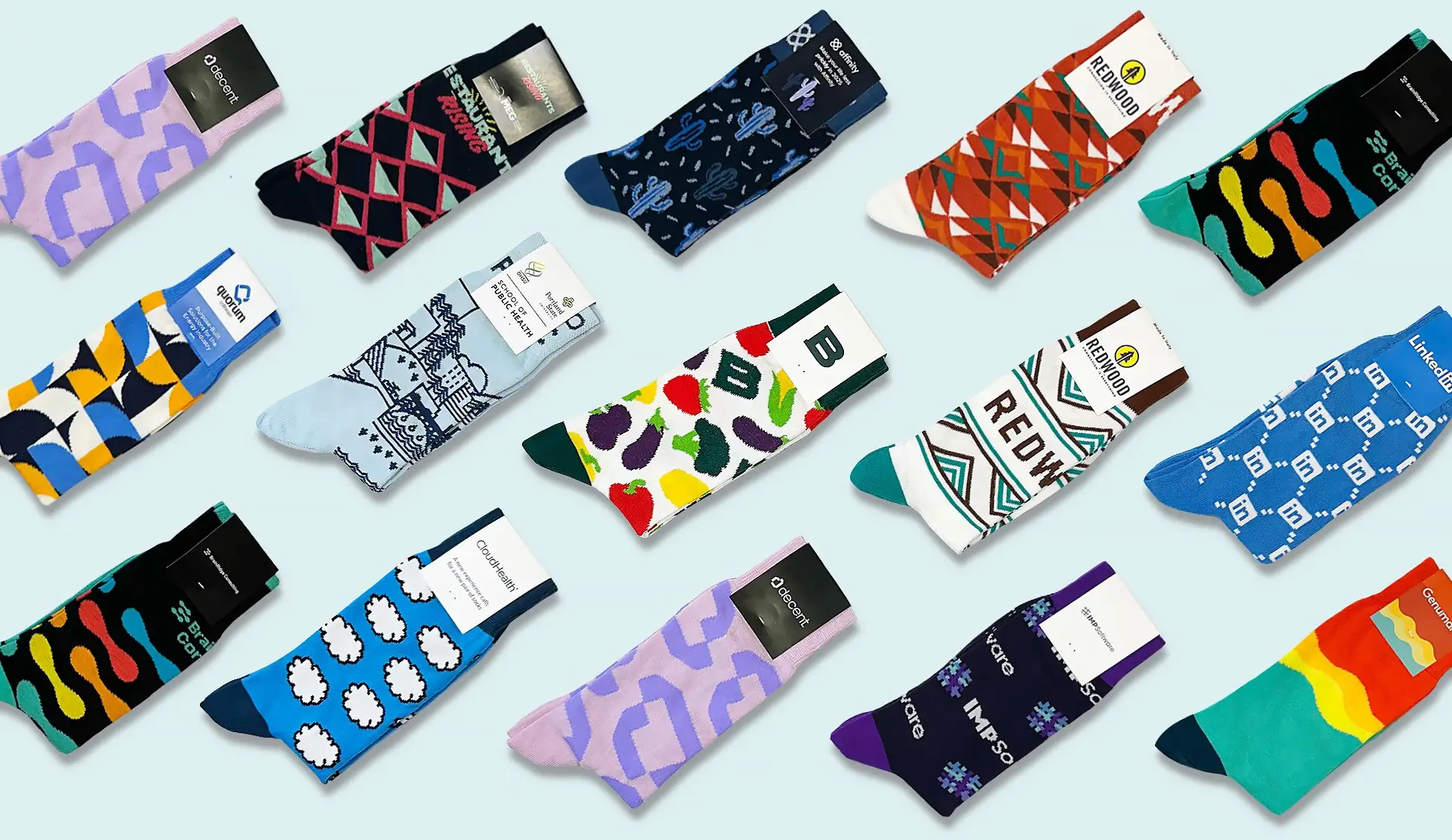
Every idea below has been knit in real life. Sockrates has produced socks for more than 5,000 brands from its mill in Castel Goffredo, Italy, so what follows is filtered by what a knitting machine can genuinely do. Real examples and visuals run throughout, so you can browse rather than read.
Understanding Your Sock as a Design Canvas
A sock is not a flat rectangle. It is a knitted tube with zones that stretch, curve and reinforce differently. A design that looks balanced on screen can warp badly once it is knit onto the wrong zone.
Spend two minutes here and every idea further down gets easier to brief.
The Cuff, Leg Panel, Heel, and Toe
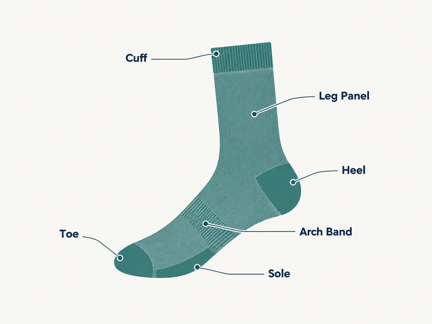
The cuff is the ribbed band at the top. It stretches every time the sock goes on, so fine detail distorts there. Use it for subtle branding, a small wordmark, or a simple stripe that frames the design below.
The leg panel is your main canvas. It sits flat, faces outward, and stays visible whether the wearer is sitting or standing. Logos, patterns, illustrations and text all belong here.
The heel and toe are shaped with extra stitches and often reinforced yarn. Patterns that run across them bend out of shape. Keep these zones simple. A solid contrast colour is the safest and best looking choice, and it reads as a deliberate design decision rather than a compromise.
The Sole and Arch Band
The sole is the zone almost nobody uses, which is exactly why it is worth using. Nobody sees it while the sock is worn. Everybody sees it in the flat-lay photo, the unboxing video and the product listing.
A short tagline, a launch date, or a small repeated icon on the sole costs nothing extra on a woven sock and gives your photography something to say.
The arch band is the narrow strip across the instep. It is too small for a full logo but sits perfectly for a compact wordmark or single icon. Brands often use it for a secondary mark, a founding year, or a short word like Crew or Est. 2014.
One quiet advantage of both zones: they let you keep the outward-facing design restrained while still getting your name onto the product twice.
Sock Design Ideas by Occasion
The right design depends far more on why the socks exist than on what looks good in isolation. A pair meant for a CFO's dress shoes and a pair meant to pull people into a booth are two different design problems. Ideas 1 to 34 below are grouped by the reason you are ordering.
Employee and Corporate Gift Socks
The test for an internal gift is simple. Would someone wear it on a day they are not thinking about work? That rules out most loud branding, and it is backed by the research. In the same PPAI study, 44% of recipients said they prefer subtle branding over big bold logos.
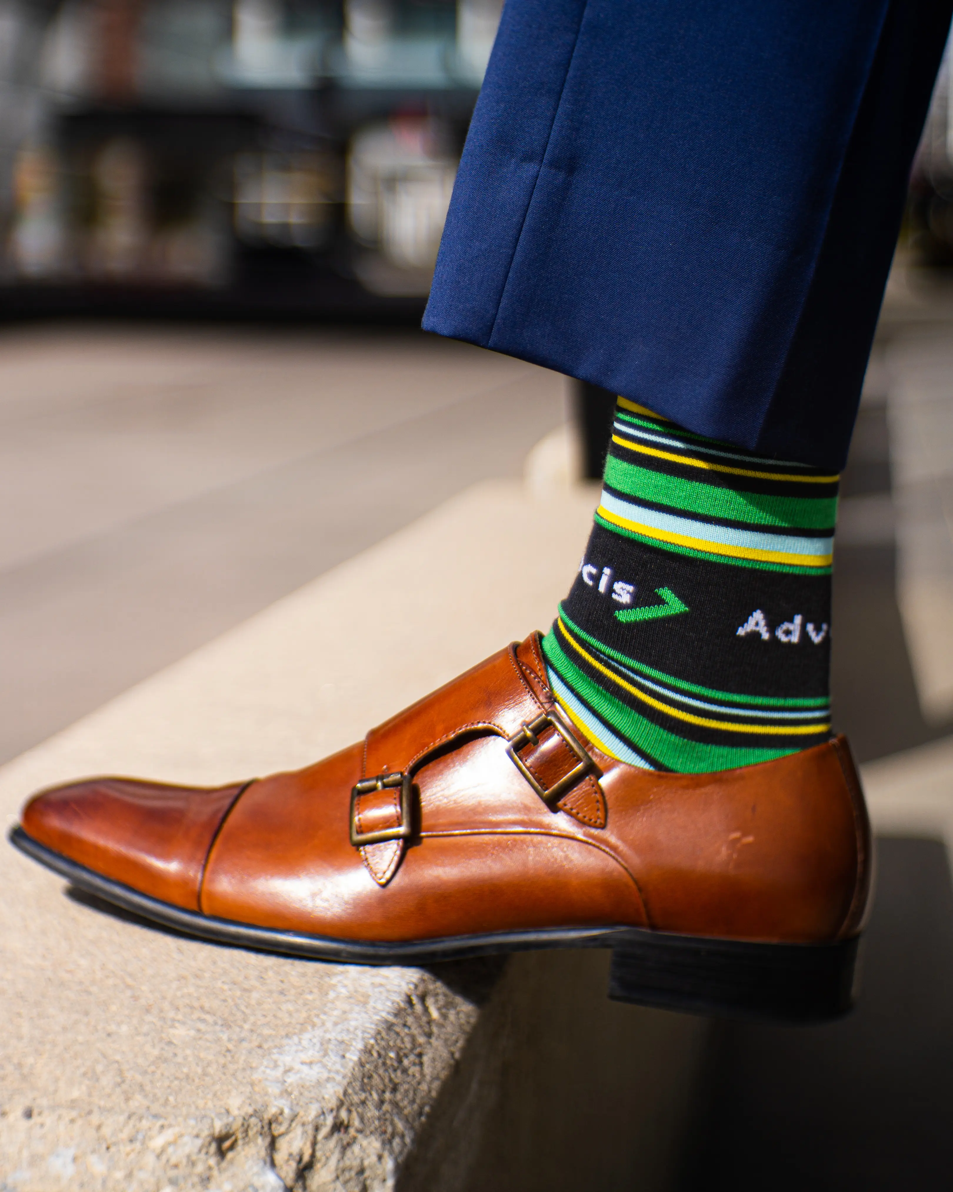
1. Tone on tone logo: Knit the logo one or two shades off the base colour. Navy on navy, charcoal on black. The mark is legible up close and invisible across a room. This is the single most requested corporate look.
2. Cuff-only branding: Leave the leg panel a clean solid. Put a thin brand-colour stripe and a small wordmark at the cuff. It shows only when trousers shift, which is the point.
3. Brand colour as the base, logo in neutral: Flip the usual arrangement. Base the sock in your brand colour and knit the logo in cream, grey or white. Reads as a considered colour choice rather than merch.
4. Dress-shoe safe palette: Build the design in one dark base plus one accent. Charcoal with oxblood, navy with mustard, black with forest green. These sit correctly under a suit, which matters if the recipient wears one.
5. The initials pair: Skip the logo. Knit the company monogram or initials small on the outer ankle. Quieter than a full logo and it survives a rebrand better.
A mercerized cotton dress sock is the usual base for all five, because the smoother yarn holds fine detail without looking bulky in a shoe.
Client and VIP Gift Socks
A client gift has a harder job than an employee gift. It has to read as a gift, not as swag. That usually means the branding drops one more notch and the materials do the talking.
6. Unbranded outside, branded inside: Design the visible surface with no logo at all. Put the wordmark on the sole or arch band. The recipient knows who sent it. Nobody else does.
7. Wool as the signal: Switch the base from cotton to wool. A ribbed cream or heather grey wool sock with one small mark feels like something bought, not sourced.
8. Single-colour texture play: Use one colour and vary the knit instead. A ribbed leg with a smooth panel creates a pattern with no second colour. Expensive looking, and quietly clever.
9. The two-pair set. Design a matched pair of designs rather than one. A patterned pair and a plain pair in the same palette. Sets feel considered in a way single pairs do not.
10. Occasion-specific detail. Knit the deal name, the project, or the year small on the arch. For a closing gift or an anniversary, that one detail is what makes it keepable.
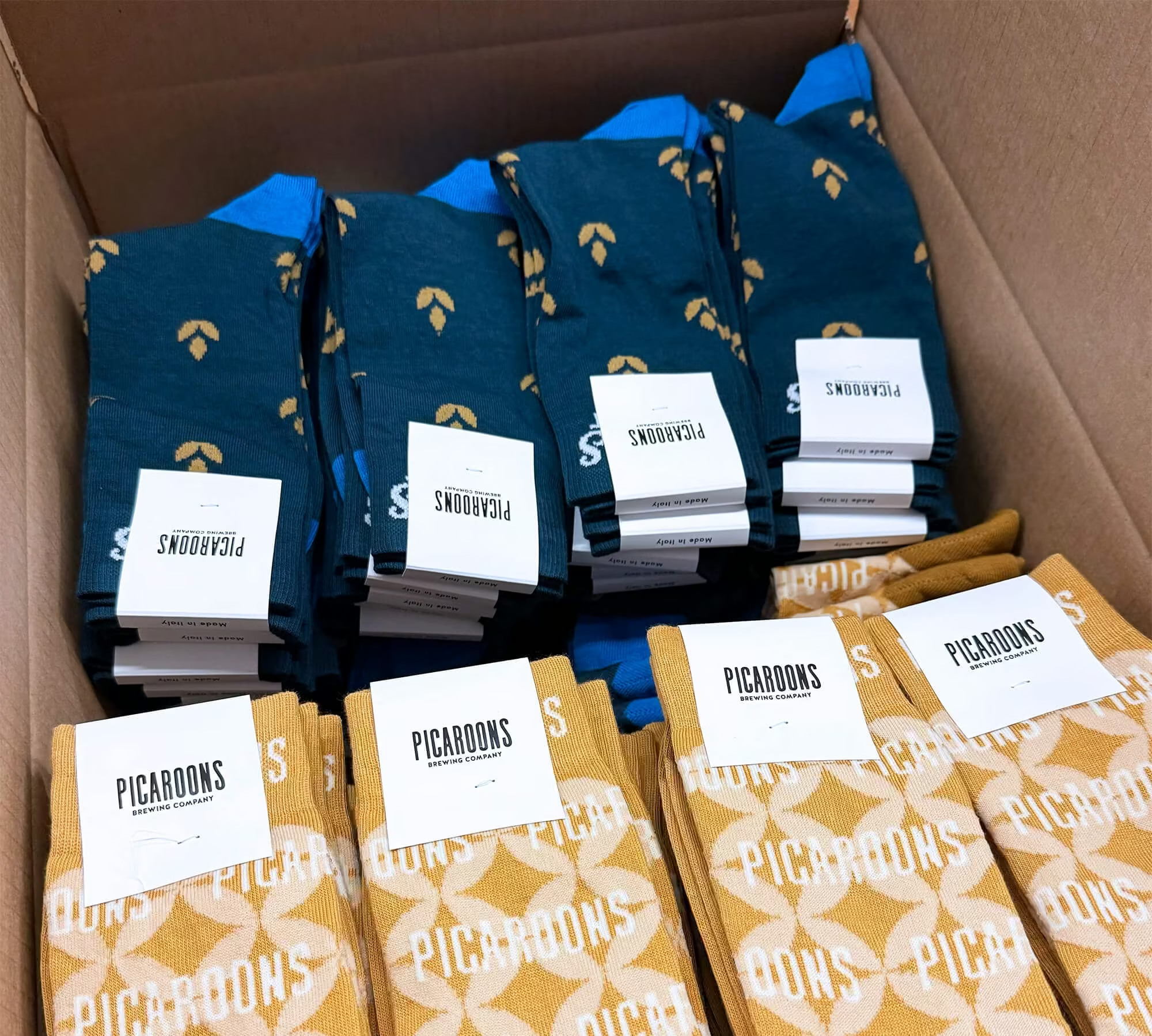
Client gifts usually get opened in front of the person who sent them, so the outside matters too. Pairing the design with matching sock packaging or a rigid sock box changes the moment completely. Pull one colour from the sock design into the box and the whole thing reads as a product.
Trade Show and Event Giveaway Socks
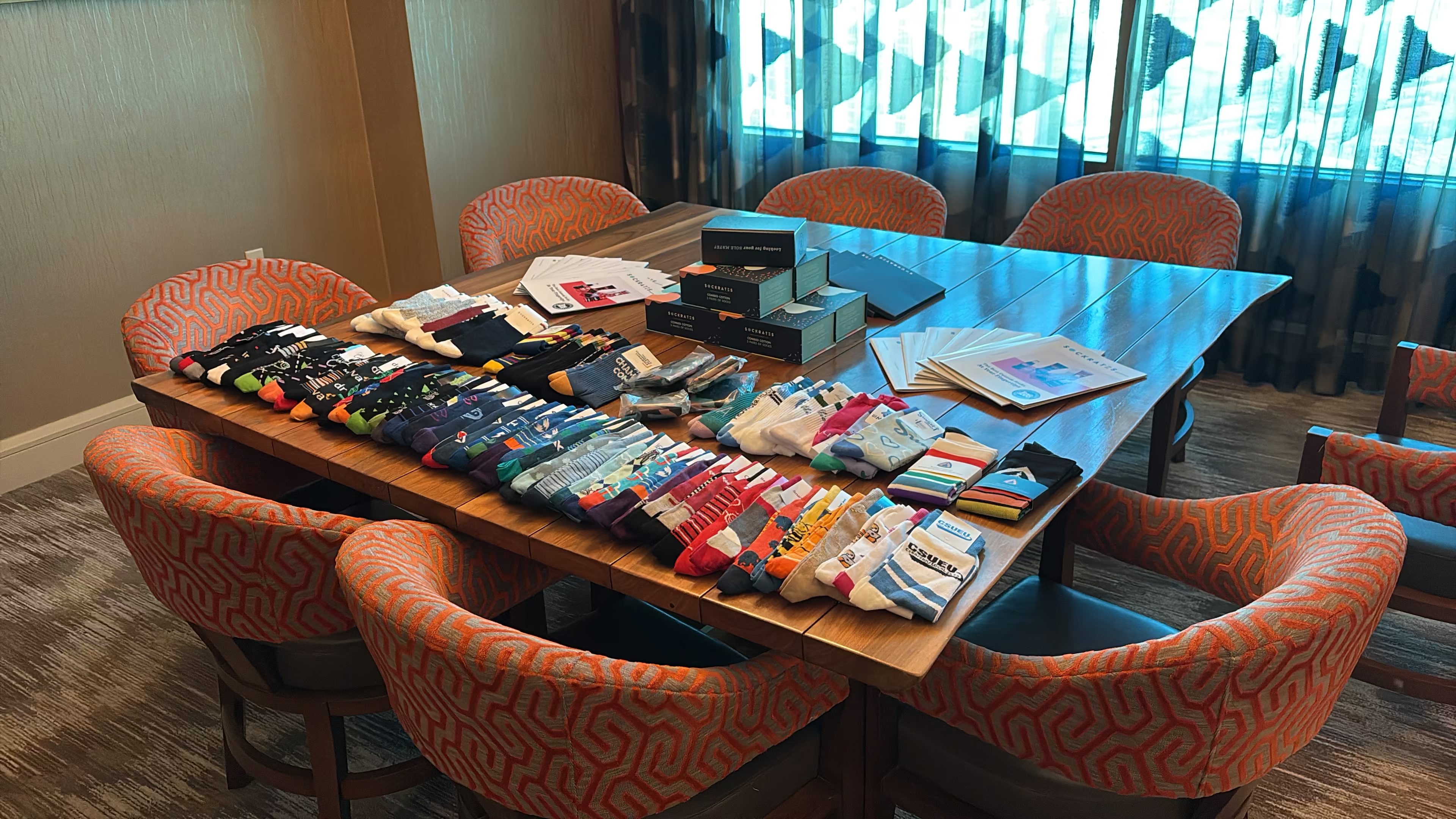
Event socks have two jobs that pull against each other. They need to be visible enough to pull people toward a booth, and wearable enough to survive the trip home. Design only for the first job and the pair never leaves the drawer.
11. High-contrast full-leg pattern: Go bold on the leg panel with two strong contrasting colours. Diagonal blocks, wide bands, or a large repeated icon. Visible from several feet away, which is the whole point on a show floor.
12. Loud sock, quiet logo: Let the pattern do the attracting and keep the logo small. People wear a great pattern again. They rarely wear a billboard.
13. Event-specific colourway. Keep your usual logo placement but change the palette for that show. Attendees who collect them start recognising the series, and your team can tell which year a pair came from.
14. Conversation-starter graphic: Knit something tied to your category that makes someone ask about it. A tiny repeated icon of what you actually sell works better than an abstract shape.
15. Sizing for a crowd: Design one pattern, order it in one-size-fits-most so the booth does not need a sizing conversation. Details on how that works sit on the sock sizing page.
Socks tend to outperform the usual booth items for a boring reason. They get used. If you are weighing options for a show, the trade show giveaways page breaks the comparison down further.
Team Building and Company Culture Socks
This is the one category where restraint is the wrong instinct. Culture socks work because they are specific to your company and mean nothing to outsiders. That is the feature, not a bug.
16. The inside joke: Knit the phrase your team says constantly. The thing someone says in every standup. It will look baffling to anyone else and land perfectly internally.
17. Department colourways: One design, one palette per team. Engineering in green, sales in orange, support in purple. Cheap identity, and people genuinely compare them.
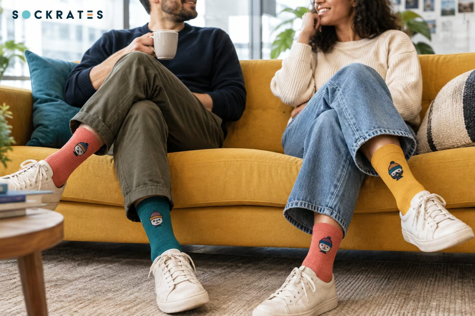
18. Mascot on the leg panel: If you have an unofficial office mascot, a pet, a plant, a character someone drew in Slack, put it on the sock. These get worn more than any logo.
19. Milestone pairs: Mark the thing that happened. Ten years, the millionth order, the office move, the funding round. Knit the number large and the context small.
20. Onboarding socks: A standard design given to every new hire in their first week. Small detail, and it does more for a first day than a branded notebook.
Uniform and Workwear Socks
Uniform socks get judged on consistency and survival, not creativity. The same pair worn four days a week for two years has to still look like the brand on day 500.
21. One design, matched across the whole team: Lock the design and reorder the same spec. A team in visibly identical socks reads as organised, and mismatched reorders are the most common complaint in this category.
22. Exact brand colour base: Match the base colour to the brand's primary Pantone reference so the socks sit correctly next to shirts and aprons that were produced elsewhere.
23. Small outer-ankle logo only: One mark, one placement, nothing else. Simple placements survive daily wear and repeated washing without drawing attention to fading, because the yarn is dyed rather than printed.
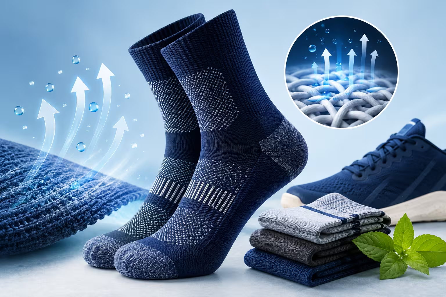
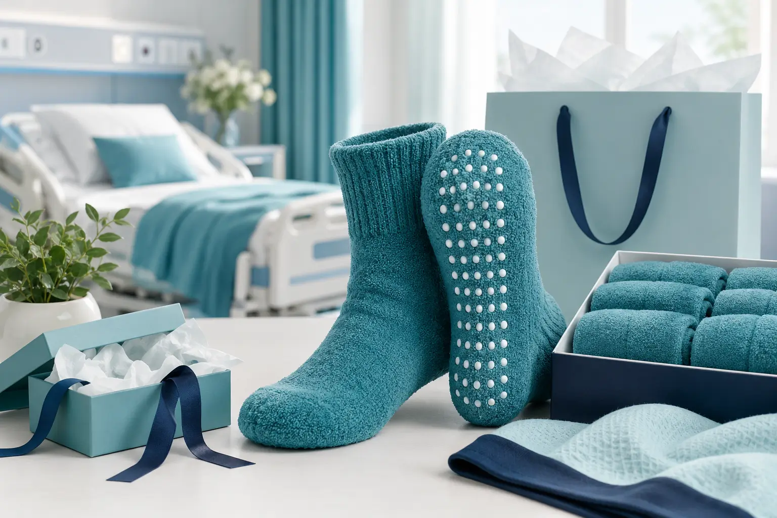
24. Function first, branding second: For roles that stand all day, choose the sock type before the graphic. Cushioned athletic styles, grip socks for studios and clinics, or compression for long shifts.
25. Role or location coding: A single stripe colour that changes by site or shift. Useful operationally, and it costs nothing extra in a woven design.
For distributed teams, design once and let the shipping handle the rest. Splitting one order across many addresses through global swag delivery keeps everyone in the same pair without a central warehouse.
Charity and Fundraiser Socks
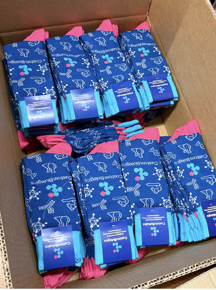
The default move is to put the charity logo on a sock and stop. It rarely works, because a logo explains who is asking rather than what is being asked. A fundraiser sock should carry the story of the cause.
26. Cause colours woven as the pattern: Take the awareness colour and build the design from it rather than adding it. Teal and white stripes for ovarian cancer awareness, or a purple and gold repeat for epilepsy, so the sock reads as the cause even without text.
27. Count or number as the graphic: Knit the figure that matters. The number of people served, meals funded, or years running. A number invites a question in a way a logo does not.
28. Symbol over logotype: Use one simple shape connected to the cause. A paw for an animal shelter, a wave for ocean cleanup, a single tree for reforestation. Simple shapes also knit far more cleanly than detailed logos.
29. Participant pairs: For a walk, ride or run, design a dated pair given only to participants. It becomes a keepsake rather than merchandise, and people wear it for years.
Where the cause is environmental, the material can carry part of the message. Organic cotton or recycled wool bases avoid the awkwardness of an eco campaign printed on something disposable.
Retail and Resale Sock Lines
Designing socks to sell is a different discipline again. The design has to work as a thumbnail, on a shelf, and in someone else's photo. Nobody is being handed this pair, so it has to earn the purchase.
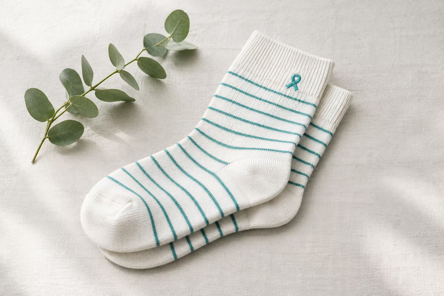
30. Design in collections of three to five: This is the most useful habit in the whole category. Build three to five patterns that share one palette. They merchandise together, photograph together, and push the basket from one pair to three.
31. One hero, two supporters: Within that collection, make one design the loud one and the others quieter. The hero draws attention in the listing photo, the quieter pairs get worn most.
32. Design for the top third: Socks are usually displayed folded or hung, so only the cuff and upper leg show. Put the recognisable element high on the sock rather than centred.
33. Thumbnail test: Shrink the design to the size of a phone thumbnail before approving. If the pattern turns to mush, enlarge the elements and cut a colour.
34. Shareable back detail: Give people a reason to photograph them. A phrase on the sole, a surprise colour inside the cuff, or a detail that only appears when the sock is worn.
Collections are also where a low minimum matters most. At 100 pairs per design, a five-pattern collection is a 500-pair test rather than a warehouse commitment. Plenty of retail lines on the project gallery started exactly that way.
Sock Design Ideas by Aesthetic and Trend
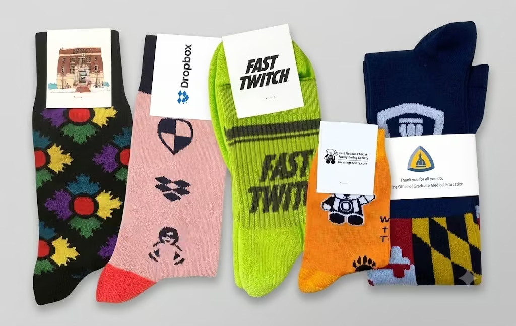
If you arrived looking for a look rather than a use case, start here. Ideas 35 to 65 are grouped by style, and they cut across every occasion above. A minimalist design can be a client gift or a retail line. The aesthetic is a separate decision from the purpose.
Bold Logo and Wordmark Designs
Big branding has a bad reputation it does not always deserve. Treated as a graphic decision rather than a marketing requirement, a large logo can look like streetwear instead of swag.
35. Oversized logo, cropped deliberately: Scale the mark until it runs off the edge of the leg panel. Cropping reads as confident. A logo shrunk to fit politely in the centre reads as corporate.
36. Repeated wordmark band: Run the brand name as a repeating horizontal band around the leg, like a waistband on athletic wear. Legible from any angle and it never looks accidentally placed.
37. Vertical wordmark up the leg: Set the name running upward along the outer leg. Unusual placement, strong lines, and it suits short names particularly well.
38. Two-colour high contrast only: Boldness comes from contrast, not colour count. Black on white, white on red, cream on navy. Adding a third colour usually weakens the hit.
Boldness works when the brand is the reason someone wants the sock. Fan merchandise, a well-liked consumer brand, a sports programme, a launch people opted into. It works less well for an internal gift, which is where the 44% preference for subtle branding bites.
Tone on Tone and Minimalist Designs
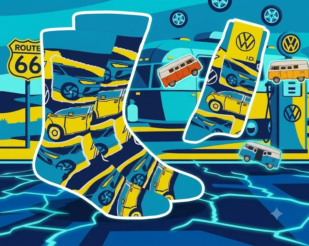
The quiet end of the spectrum, and the hardest to get wrong. One base colour, one or two shades of variation, nothing else.
39. Shade-shifted logo: The logo knit two shades lighter or darker than the base. Visible in the right light, invisible otherwise.
40. Single fine line: One thin contrast line at the cuff or above the heel. That is the entire design.
41. Solid with a hidden detail: A completely plain sock with one small mark on the arch or sole. Nothing on the visible surface at all.
42. Neutral palette family: Build a set in bone, stone, taupe and off-black. No pattern, just a considered range of neutrals.
Minimalist designs age better than trend-led ones, which matters if you reorder the same spec for years.
Pattern and Repeat Designs
Patterns are the most browsed category in sock design, and the one where production knowledge matters most.
43. Classic stripes: Vary the rhythm rather than defaulting to even bands. Two thick, one thin. Wide base stripes narrowing toward the cuff.
44. Argyle: The most recognisable sock pattern there is. Modernise it by cutting the palette to two colours and enlarging the diamonds.
45. Chevron and zigzag: Directional and energetic. Works well for sports and outdoor brands because it implies movement.
46. Polka dots: Scale changes everything. Small dots read as formal and traditional, large dots read as playful and current.
47. Geometric tiles: Squares, triangles or hexagons in a repeating grid. Good for tech and design brands that want pattern without novelty.
48. Logo as the repeat unit: Turn your mark into the pattern itself, tiled small across the leg. Branding and pattern in one move.
One production note worth briefing your designer on. Every repeat has to close cleanly where it meets around the tube of the sock. Get the maths wrong and there is a visible seam line where the pattern collides. A good design team catches this before production, and it is one of the things a proof review is for.
Color Blocked and Colorway Matching Designs
Some of the best sock designs contain no graphic at all. They just use colour precisely, borrowed from something that already exists.
49. Jersey match: Pull the exact palette from a team kit or uniform. The socks then work as part of the set rather than as an accessory to it.
50. Product line match: Take the colours from your packaging or product range. If your box is orange and grey, the sock is orange and grey. Instant recognition without a logo.
51. Split colour blocking: Divide the sock into two or three solid fields. Cuff in one colour, leg in another, heel and toe in a third. Graphic, simple, and it knits perfectly.
52. Brand guideline palette, full stop: Use only the approved colours from the brand book, with no logo at all. Marketing teams approve these quickly because there is nothing to argue about.
This category depends on colour accuracy, which is why it suits woven socks. Because colours come from dyed yarn matched to a Pantone reference, your blue arrives as your blue rather than an approximation. Worth checking whether per-colour fees apply wherever you produce, since some manufacturers charge by colour and that quietly limits design choices.
Mascot, Icon, and Illustration Based Designs
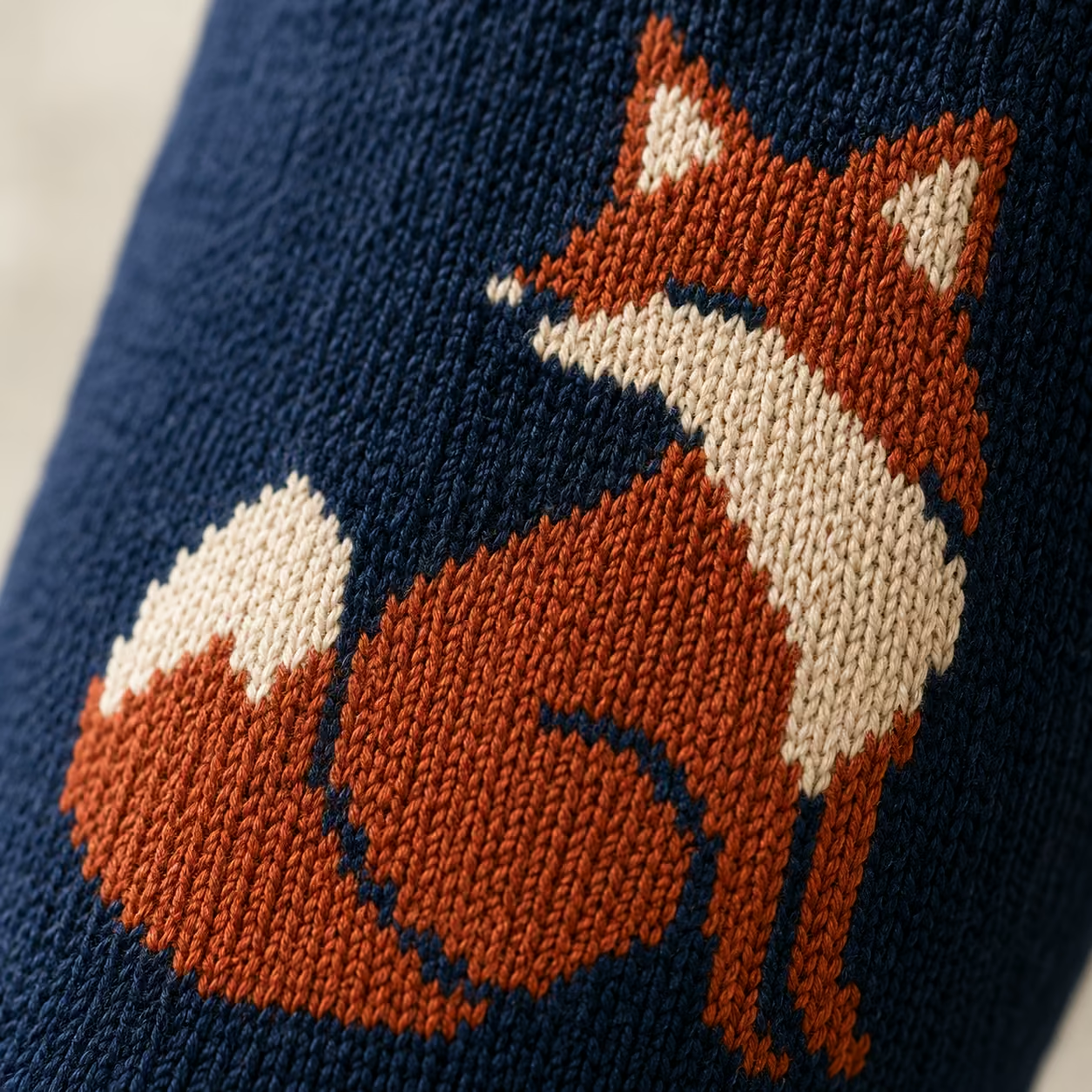
Illustration on socks lives or dies on simplification. A knitted design is built from stitches, so it behaves more like pixel art than print.
53. Mascot on the outer ankle: One character, placed on the outer ankle where it stays visible with shoes on. Bold outlines, flat colour, no gradients.
54. Animal repeat: A simplified animal tiled across the leg. Dogs, bees, foxes and whales all knit well because their silhouettes are recognisable at small size.
55. Product illustration: Draw what you actually make. A coffee roaster puts beans on the sock, a brewery puts cans, a bike shop puts frames.
56. Icon set across a collection: One icon per design, four or five designs, same palette. Popular for retail lines and for departments.
The practical rule is to test your illustration small. Simple bold shapes translate best to a knitted format, and fine interior detail tends to disappear. For genuinely complex artwork, photographic detail or unlimited colours, DTG printed socks are the better route.
Seasonal and Limited Edition Designs
A seasonal design exists to mark a moment, which gives it permission to be more specific than an evergreen design.
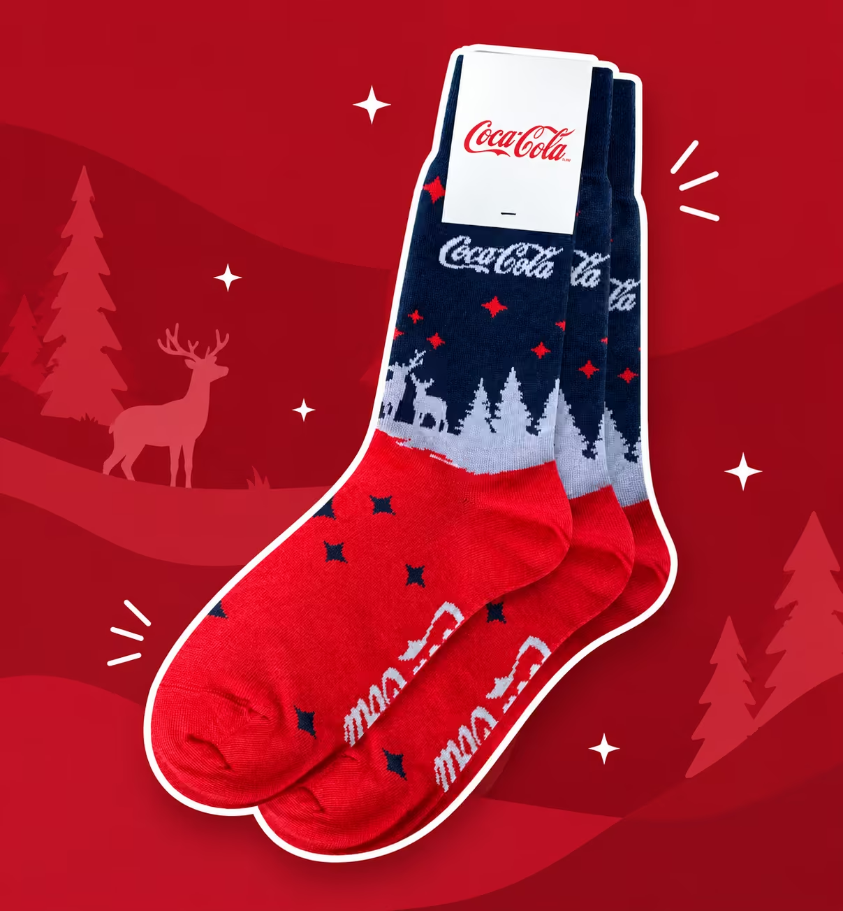
57. Winter without the clichés: Skip the snowflake clipart. Use a deep seasonal palette, forest green, oxblood, cream, on a wool base. Reads as winter through material and colour instead of decoration.
58. Dated launch pair: Knit the launch date or version number into the design. Product teams love these, and they become a record of when something shipped.
59. Anniversary edition: Mark the year with a design that only exists that year. Five, ten, twenty five. The scarcity is what makes people keep it.
60. Numbered drop: For retail or fan audiences, produce a fixed run and say so. A design available once creates urgency that a permanent line cannot.
Seasonal timing is the practical constraint. Holiday orders tend to arrive late and compressed, so knowing your production window matters more than the design itself.
Nature, Sport, and Industry Inspired Motifs
The strongest designs usually come from a brand's own world rather than from a trend list. Look at what your business actually looks at all day.
61. Outdoor brands: landscape lines: Mountain ridgelines, contour lines or wave forms running around the leg. Abstract enough to stay wearable, specific enough to be recognisable.
62. Sports brands: dynamic diagonals. Angled stripes and speed lines that imply motion. These suit athletic styles where the sock is seen mid-movement.
63. Food and drink brands: product motifs. Coffee cherries, hop cones, chilli peppers, croissants. Simplified and repeated, these are some of the most cheerful socks produced.
64. Technical and industrial brands: blueprint detail. Circuit traces, gear teeth, pipe schematics or grid lines. Unexpected on a sock, and instantly readable to people in that industry.
65. Healthcare and clinical brands: calm structure. Quiet geometric repeats in soft palettes, often on compression or grip styles where the sock has a job beyond branding.
That is 65 directions. Almost none of them require a designer to start from nothing, which is usually the real blocker.
Design Principles That Make Bulk Socks Look Professional
The gap between an amateur sock and one that looks like it came from a real brand is rarely the idea. It is four technical decisions, all of which get made before production whether you think about them or not.
Woven Knit vs Printed Socks
These are two different products that happen to share a shape.
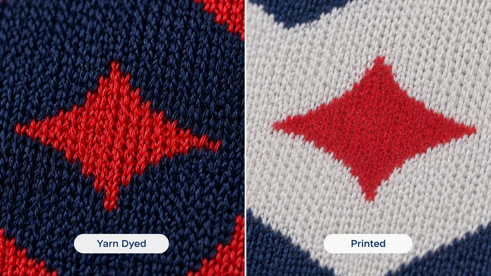
In a woven knit sock, the design is built from coloured yarn as the sock is made. The colour is structural. It cannot fade, peel or crack, because there is nothing sitting on the surface to come off. The trade-off is a limit on colours per design and on how fine the detail can be.
In a printed or sublimated sock, the design is applied to a finished blank. That allows unlimited colours, gradients and photographic artwork. The trade-off is that the design sits on the surface, so it behaves like print on fabric over time.
This choice decides which ideas above are realistic. Tone on tone logos, argyle, colour blocking and clean repeats are woven territory. Photographic images, complex gradients and face socks need printing. The woven versus sublimated comparison covers the difference in more depth.
Choosing Colors and Pantone Matching
Woven designs work within a limited number of colours per design, typically a handful rather than dozens. That constraint is not a downside. Most of the best looking socks use two or three colours.
Exact matching matters because brand colours are the part people notice unconsciously. A logo knit in nearly the right blue looks slightly wrong next to your other materials, even if nobody can say why. Matching to a specified Pantone removes the guesswork, and dyeing yarn to that reference is what keeps the sock consistent across reorders.
One commercial detail to check anywhere you produce. Some manufacturers charge per colour, which quietly pushes designs toward being simpler than they need to be.
Logo Sizing and Placement
Oversized logos are the most common mistake in custom socks, by a wide margin.
A usable rule of thumb: keep the logo to roughly a third of the width of the leg panel, positioned on the outer ankle or mid-leg. At that size it is clearly legible from standing height and still looks like a design element rather than a label.
Two placement notes. Avoid crossing the heel or toe, where the shaping will distort the mark. And remember that trousers cover the upper leg when seated, which is why the outer ankle is the most reliable spot for anything that must be seen.
Typography That Works on Knitted Socks
Text on a sock is built from stitches, so it has a minimum size below which letters stop being letters.
Bold sans serif fonts hold up best. Thick, even strokes survive the translation to knit. Thin weights, delicate serifs and script fonts tend to blur or break apart, because the fine strokes fall between stitches.
Keep text short. One word or a few characters reads cleanly. A full tagline in small type rarely does. If the wordmark must stay legible, ask for it enlarged rather than thinned.
How to Bring Your Sock Design to Life
Most people overestimate what they need before they can start. You do not need finished artwork or a designer on retainer.
Sharing Your Idea and Getting a Mockup
The starting point is usually a logo file and a sentence. Something like idea 3 in navy, or a rough note pointing at two of the directions above.
Send your logo in whatever format you have, plus any references. Screenshots, a competitor's sock, a photo of a jersey, a page from your brand guidelines. All of it is useful. The designers work from that to produce sock mockups showing how your brand translates onto a knitted tube.
Turnaround is the part worth knowing. Free designs come back within about 24 hours, which means you can test an idea today and have something to circulate internally tomorrow. There is no cost and no commitment at that stage.
If you would rather draw it yourself, the free sock templates are built to production spec with safe zones and colour guides, for Illustrator, Photoshop or a PDF export from Canva.
Reviewing, Revising, and Approving Your Design
The mockup stage is where the design actually gets decided, and it is deliberately low risk.
You pick the direction you like and say what to change. Bigger logo, different base colour, drop the third colour, move the mark to the ankle. Revisions are unlimited and free, so there is no reason to accept something that is nearly right.
Before a bulk run, a pre-production sample can be made from the approved design so you can check colour and placement on a real sock rather than a render. Nothing goes to production until you approve it, and the full sequence is laid out on the process page.
Common Sock Design Mistakes to Avoid
Five things worth catching before you approve anything.
Making the logo too big: The most frequent one. A logo covering the whole leg panel turns a wearable sock into a uniform nobody chose. Scale it down and it gets worn more.
Forgetting how the sock folds: Socks are usually packaged folded or rolled, so part of your design disappears at the point of sale. Check where the fold lands before approving.
Using too many colours: Every extra colour adds visual noise and, with some manufacturers, cost. Two or three colours almost always looks more expensive than six.
Designing a generic sock: A plain logo on a plain base is forgettable, and forgettable merch gets binned. Boring or generic designs were the second most common reason consumers rejected a branded product outright in PPAI's study, behind poor material quality.
Skipping the sample: A mockup is a render, not a product. On a first order especially, seeing one real pair before committing to hundreds is worth the small delay.
Ready to Design Your Custom Socks
Any of the 65 ideas above can be produced. The question is only which one fits what you are trying to do.
What makes them straightforward to execute is the setup. The minimum is 100 pairs per design, so a single idea can be tested rather than committed to. Designs come back free within about 24 hours, with unlimited revisions until the design is right. Full Pantone matching applies with no per-colour fees, so a four-colour design costs what a one-colour design costs. Production and delivery run about 7 days from approval, which makes a fixed event date realistic.
That combination also explains why design quality pays off. Consumers in PPAI's 2026 study said they were very likely to keep a branded product for six months or longer, and they named durability, design and material as the reasons.
Pick the idea number that fits, send your logo, and see it on a sock before you decide anything. Start with free designs.
Frequently Asked Questions
Create socks your team will actually be proud to give away